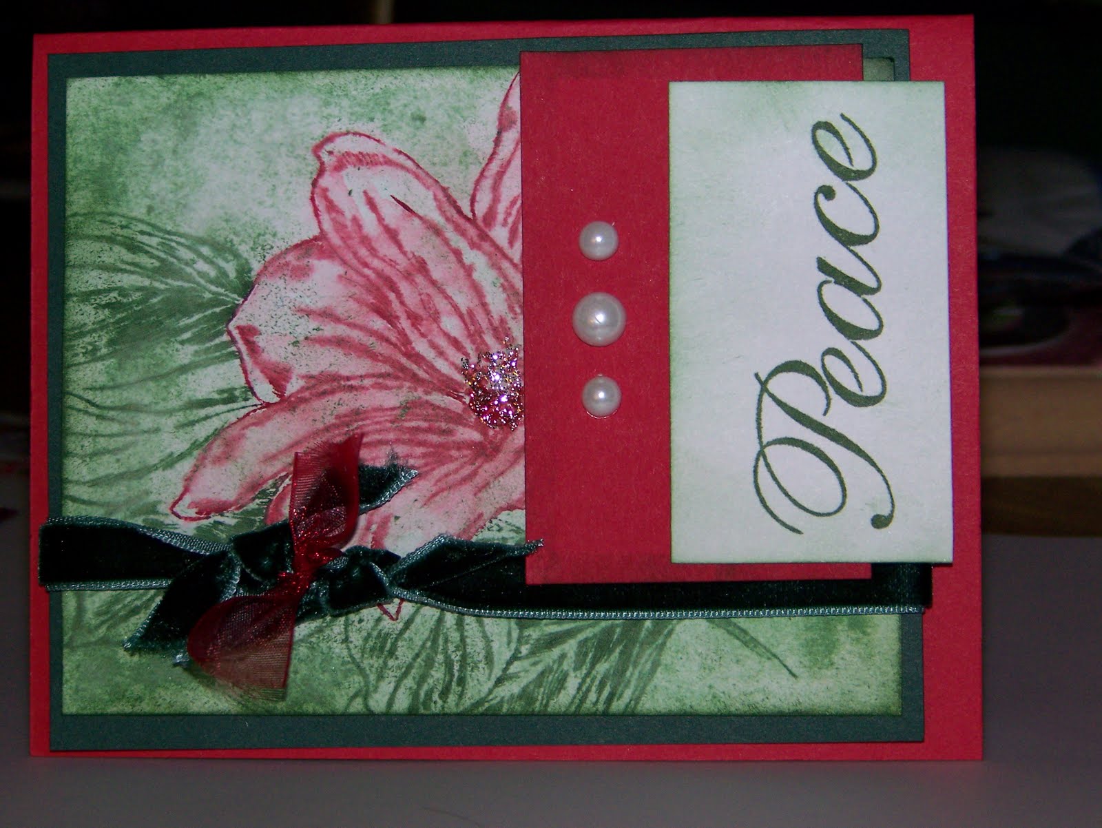
 This was the final card I did for VSN. Boy was it a challenge too! The idea was to use the blurred watercolor technique found here. Discovery: I love to watercolor, but I am not good at this technique at all! It was really difficult to get it right, and I'm still not happy with the final product, but it was worth trying. If any of you have any ideas at all how to fix this and make it better, please feel free to comment and make suggestions....please!!!
November 22, 2009
Watercolor Peace
This was the final card I did for VSN. Boy was it a challenge too! The idea was to use the blurred watercolor technique found here. Discovery: I love to watercolor, but I am not good at this technique at all! It was really difficult to get it right, and I'm still not happy with the final product, but it was worth trying. If any of you have any ideas at all how to fix this and make it better, please feel free to comment and make suggestions....please!!!
Thanksgiving Card Patterns Sketch challenge

I found this blog that is new to me and is a lot of fun. It's over here. This is the sketch challenge for this week they have posted over there. It's a very unique and fun sketch.
 I really love the colors of autumn and this was a fun one to experiment with. I got out my nesties and my sizzix texturz plate and went to town. I love textures as well, so I had fun putting those in here. The card base is handsome hunter. Then on top of that I put another piece of handsome hunter that was embossed with a texture plate. The circles are all nesties, and the flowers come from my three flower punch. For a little more fun and texture, I added brads and frayed twill that I also stamped on.
Stamps: Happy Blessings
Paper: Handsome Hunter, Old Olive, Very Vanilla, Chocolate Chip and Crushed Curry
Ink: Dusty Durango, Crushed Curry, Old Olive
Accessories: Antique copper brads, twill tape, nesties, texturz plate, and stampin' write markers.

November 21, 2009
Dear Friend Victorian Style

So another challenge posted this weekend was to make a card that resembled a particular historical era of costume clothing and there must be pearls on the card. Well, I love the clothing of the Victorian era. It doesn't seem to me that many defined eras had more beautifully romantic and feminine clothing than that time in history. So I found my inspiration in this era. In my scrap box, I found this beautiful lace. The picture really doesn't do the lace justice. It just feels so soft in your hand as well. Then I decided to finally use some things in my pretties kit. I have yet to find much of a use for the hat pins and flowers, but they all came together here. It seems the victorian era used a lot of hats, pins, pearls, lace, flowers, etc. So I put as many in here as I could throw in. Then I found the sentiment in this retired stamp set and it just worked beautifully with this card.
Stamps: Dear Friend
Paper: Very Vanilla, Whisper White
Ink: Soft Suede
Accessories: Pretties kit, and some scrap lace.
November 20, 2009
Friend to Friend
 Well, I decided to participate in another challenge. I know, I know, but this was only a sketch challenge. No big deal. Right? Wellll.....it turned out a bit of a tricky one. LOL. But I think I got it. I decided to venture into some more of the new in colors. Until this card, my bermuda bay stamp pad remained unopened. Gasp! But, alas, I found it a use. The color is very pretty and vivid, but it's so bright, and I like earthy. So I pulled out some of my Unity stamps to try to find one that would work on this layout, and this is what came about. The stamps come from the June 09 kit of the month from Unity. Prima flowers and a rhinestone brad (have you figured out I like sparkles LOL) were the finishing touches. The layout can be found here.
 Stamps: Unity Kit of the Month June 09 Perfect in Every Way
Paper: Stampin Up melon mambo designer paper, whisper white, bermuda bay, kraft
Ink: Bermuda Bay, Melon Mambo
Accessories: Petals a Plenty embossing folder from SU, rhinestone brad, half back pearls, prima flowers.
Let's Give Thanks...
 Yet another card for this last VSN was made using the emerging color technique found here. This is actually a very simple technique to do and would be easy to make into a one sheet wonder. I chose to work more with the new in colors as I have not used them much and these three make beautiful fall colors as well. That brown is what happens with soft suede when the color is very concentrated. It's such a rich and beautiful brown, don't you think? The stamp set is a retired, but much loved one. So I pulled it out as well for this one. There really isn't much to say about this one. LOL
Stamps: Stitched Exotics, Holiday Best (hostess set)
Paper: Crushed Curry Cardstock, Whisper white
Ink: crushed curry, dusty durango, soft suede
Accessories: retired hodge podge hardware buckle, clear embossing powder, brayer, Martha Stewart baker's twine.
'Tis the Season
 Card 2 in the VSN challenge cards I completed is a bit non-traditional in colors, but it still has a very Christmas-like feel to it. The challenge here was to find inspiration in the 8.5x11 scrapbook page gallery over at splitcoast. So this layout came from there. I used a bit of emboss resist on the angel and she looks so elegant! Also I used one of the new in colors for this one. i really like the feel of how it turned out. This one looks complex, but believe it or not I did complete it in the 45 minutes allotted.
Stamps: Inkadinkadoo clear stamps, Stampin' Up! Medallion background
Inks: Rich Razzleberry, versamark
Accessories: gold embossing powder, Martha Stewart border punch and snowflake punch, dew drops, Stampin' Up shimmer paint
Paper: Rich Razzleberry, Barely Banana, Whisper White
November 19, 2009
Japanese inspired Criss Cross and color throwdown challenge
 Today I decided to challenge myself a bit. I needed to make a thank you card for a very nice person who so generously gave each member of our family a very nice set of chopsticks from their recent trip to Japan. He is very interested in Japanese culture and just recently married a Taiwanese lady who he met while studying in Japan. So I got on the internet and looked at Japanese clothing for some inspiration. I discovered that the shape and style of a kimono lends itself very well to a criss cross card. I added a band with a layer of satin ribbon on the bottom in resemblence of the sash around the waist of a kimono.
 This color combination of very vanilla, old olive, real red, and chocolate chip really seemed to fit as well, and it just so happens it is a color challenge listed for today at color throwdown's blog. I love this blog and find a lot of color inspiration there. This is the first time, though, that I've actually submitted anything for their competitions. The card the fits inside the criss cross was stamped in olive green and chocolate chip. I found the turorial for the criss cross card here.
Stamps: all SU retired stamps--Garden Silhouettes, and Wonderful Words
Paper: SU DSP scrap, real red, chocolate chip, and very vanilla
Ink: Old Olive Chocolate Chip
Accessories: SU chocolate chip satin ribbon, boho punch, square rhinestone brad
Christmas Peace
 Well, it came and went and I actually got to do a few. what? Oh, I'm talking about VSN over at splitcoast stampers. It was a masquerade ball theme are there were a lot of really challenging challenges this time around. The challenge for this card was to use ruched or gathered ribbon somewhere on the card and the card itself had to be a case of something in the gallery. I found the card I wanted to CASE and I have to say this one looks nothing like the original other then the theme and layout. For my card I used stamps I bought at a craft store (I believe these are inkadinkadoo ornaments). They are stamped with encore inks and then embossed with holographic powder. Not really a lot to say about this card. It's pretty simple.
Stamps: Inkadinkadoo clear stamps, dollar bin stamp from craft store
Inks: Encore gold and silver, soft suede
Accessories: gold cord, rhinestone brads, gold metallic ribbon, holographic embossing powder
Paper: whisper white and bridal specialty paper from Stampin Up!
November 10, 2009
Baby gift card holder

A friend of mine asked me to make her a gift card holder for a friend who is having a baby girl. Since I have a boy, I wanted to make it as girly as possible. I found this template on SU's demonstrator website so I printed it off and used it to make the card front. For the card base, I used some retired SU designer paper and made a folded gift card holder. The inside has a pocket in the crease of the card. The dress is also out of some retired SU designer paper. White taffeta ribbon is a must for anything frilly, and of course you have to have some sparkle which is where the rhinestone brad came in. I used a gel pen and marker for the stitching and belted accents.
November 09, 2009
Twilight inspiration


So I have a friend who I love dearly, but she has an obsession--anything Twilight. She can tell you just about anything you ever wanted to know about the movie(s), actor(s), characters, or books. So of course when her birthday came around, it was obvious what track to take with her card. Twilight. Since I don't have anything Twilight as far as stamping goes, it was time to put the thinking cap on and find some inspiration. So I took the colors from the books--everything is red, black and white, and drew on my memory from when I read the whole series and this is what I came up with. I wanted something earthy, classy and elegant all at the same time. So I found these gorgeous papers from Basic Grey and Stampin Up. The sentiment is heat embossed in red. It's really hard to see, but on the sides of this stand up card, I stamped the pine tree line from Noble Deer set all along the top edge of the red and white paper. Then I added a wolf (because you have to Jacob), and a deer (because that's what the Cullens' like to eat that's close by). Voila! A twilight inspired card.
November 08, 2009
Dasher, my friend...

I just really love this stamp and will be using it a lot. This time, I embossed him with gold embossing powder and kept the card layout really simple. He is embossed on a piece of soft suede cardstock that has snowflakes from the Serene Snowflakes set stamped in Soft Suede in the background. The white piece on the side is the reindeer from the Winter Post set embossed in gold as well. The background of it has Serene Snowflakes stamped in Pretty in Pink. The card base is pretty in pink with white and soft suede as the other two card stock colors. For the edge of the Dasher piece I took some sticky strip and adhered it to the sides. Then I heat embossed gold powder on the sticky strip for a rough metallic frame. The ribbon on the sentiment is white taffeta. I love this color combination and this is one of my more favorite cards.
November 07, 2009
Lovely Tree

I liked the way this card turned out in spite of the fact that my little one declared it as "not good mom, not good at all." Such a critic at such a young age! Anyway, I used lovely as a tree and stamped with versamark and hten heat embossed it with gold embossing powder. The bird is from an old retired SU set (I think it's called Wildlife Reserve). The sentiment is from the Four Holidays set out of the current mini catalog, and the snowflakes that are versamarked are from Winter Post. The bird on the front sits in a cut out circle so he is actually inside the card, but seen in both inside and out.
November 06, 2009
another top note gift card holder

Here is another top note gift card holder just like you saw in a previous post. This was the final design for this card holder, and is my favorite by far. The base of the card is ruby red. The medallion stamp is stamped in real red and offset on the front. For the sentiment I used the holiday hostess set and stamped in real red on kraft card stock, punched it out with the large oval and then sponged the edges lightly with real red. A punch of a scallop oval sits behind the large oval to frame it in. This is attached to the white organza ribbon with a piece of silver twine. For the hinge, I used just a single rhinestone brad. Inside is a pocket made of designer paper to match the front of the card.
November 05, 2009
punchy monkey

Here is a cute little monkey I made as a surprise for my little one's lunch box. It turned out pretty cute and was really simple to make. His head is a 1 3/4 inch circle of chocolate chip, and the close to cocoa is a 1 3/8 inch circle punch. the nose is a large oval. The ears are 1 inch circles with 3/4 inch circles set inside them. The eyes are 1/2 inch circles with 1/4 inch circles set inside them. The features and accents are all drawn in with a chocolate chip marker and a white gel pen. Then a small band was made to fit around the mini candy bar.
November 01, 2009
Razzleberry Medallion
 I have been experimenting with non-traditional colors this year for some Christmas cards, and I have to say I like the look of Razzleberry for Christmas cards especially with whisper white. Those are the only two colors on this card. This one is extremely simple to do. The new medallion background stamp from SU is one my very favorite stamps of all time, and it shines here in such a simplistic form. It is stamped in Razzleberry as well as the sentiment from the four the holidays set. The edges of the whisper white are sponged lightly with razzleberry and then mounted on a card base of razzleberry. The ribbon is whisper white taffeta.
October 31, 2009
Oh how we love Dasher!

Finally, this card is all my own. I came up with this one after being inspired by a post on Michelle Zindorf's blog. The colors are very simple--Not Quite Navy, Night of navy, black and white. The main image is more simple than it actually looks. I got out a sponge and started adding in the colors of the background. Not quite navy was sponged over the whole piece of white paper and then night of navy around the edges and lightly in spots in the middle and then finally black around all the edges. I used Lovely as a Tree by Stampin' Up and stamped it in the background on top of the sponging. More sponging was added just a bit to make the trees recede a bit more into the background. Accents were added to the trees with black marker and white gel pen. Then I stamped Dasher on top of the trees in the foreground using basic black. White gel pen was added for highlights and depth. The gel pen really made Dasher pop out of the background a whole lot more. The paper behind the main image is a piece of not quite navy designer paper out of a prints pack. It was embossed with the beautiful Stampin Up Sizzix impressions folder Petals a plenty. Then I took my sanding block and lightly sanded the navy off the texture to get the white texture that kind of looks like snowflakes in the background. A black mat behind the main image and a strip of black for the ribbon to rest on were the finishing papers. The ribbon is whisper white taffeta.
October 30, 2009
Serene Snowflakes

This was another case'd card I believe from Christine Creations blog, but I could be wrong. I really need to start writing this stuff down. I just case so infrequently that I don't even think about it. LOL. Anyway, the color combo was part of the challenge on her card. It's very beautiful. The colors are soft suede, pretty in pink and whisper white. Not very traditional for a Christmas card, but I like this one a lot. I did mine kind of as a one sheet wonder thing. I took one whole sheet of whisper white and stamped the snowflakes all over it in soft suede and pretty in pink. then I started cutting the pieces I needed for the front of the card. The sentiment is from Four Holidays. I used another sheet of whisper white to make the big snowflakes. They were stamped in Soft Suede and punched out with the 1 3/4 inch circle punch. The layers behind it were cut with my nesties. The larger piece of soft suede has more snowflakes stamped on it in soft suede (another one sheet wonder thing). The ribbon is a piece of white taffeta ribbon. I really love the way this card turned out.
October 29, 2009
Gift card holders cased
 Okay, first let me say that these were cased or copied from other sources, but I just can't remember where I found them! So I'm sorry I can't give the credit where credit is most definitely due. These were gift card holders prepared as samples in an effort to find something to do for a class project. The birdhouse one was originally not hinged, but I made the roof hinge and the house itself is a pocket to hold the gift card. So it's a flat mailable card. I loved this little card and it was so fun to do, but a bit tricky.
this view is with the hinge open.
 Here it is with the hinge closed.
 These are very quick and easy to do and ended up being the class project. here are several variations of the same thing. They are made from two top notes hinged together with a brad at the top. Very simple. The inside has a pocket made of a little less than half of a top note die out of designer paper so it only takes a scrap. Each variation is a little bit different. All of the ones shown are stamped on designer paper in a matching ink. here it is ruby red, taken with teal or real red. The papers come from Stampin Up's Holiday Lounge or Christmas Cocoa papers. The final design that we ended up using is not shown here, but it was done on solid ruby red card stock. I will have to find my sample (it has been missing in action for a while) and put a picture of it up for you to see.
This one is my favorite variation of all of the ones you see here. I used my top note and made layers behind the red image that was trimmed along the dotted edge to fit inside the layers behind it. The boho punch was used to make the embellishment at the top. The ribbon is white taffeta with some red grosgrain attached to the middle and frayed.
October 28, 2009
Scallop Envelope baskets
 This is the time of year for fall fun and parties. My preschooler has his fall party for his class tomorrow, and I made these little baskets to hold the treats I signed up to bring. The were really quite simple to do. They are all made of the sizzix scallop envelope die that Stampin' Up sells. Four pieces per box and a little tombow adhesive (love this stuff by the way) and voila you have cuteness! I have to say, these cats are my very favorite. They are my own creative genius. I could not find instructions anywhere for a punch art cat that I liked, so I came up with my own. For the ears, I used the five-petal punch and punched on black and one pink then I offset the pink inside the black. The head is a 1 3/4 inch circle punch. The eyes are 1/4 inch circle punch that I used a black marker and white gel pen for accents. I used the 1 3/4 inch circle punch to make the nose part. First punch one circle then punch off a part of it using the same punch to get that shape. The nose is half of a 1/4 inch square. then the accents are white gel pen. The edges are all lightly sponged with very vanilla craft ink just to make them pop out a bit. I used my boho and three flowers punches for the little flowers and added a touch of stickles to the centers for accent. I would have put in a brad, but it's not such a good idea for preschoolers. So I used the trusty silver stickles. The cardstock for the baskets is pumpkin pie. The handles are attached with staples, but if I'd thought about it, a brad would have been better so the handle can swivel. However, I don't know that I would trust a three year old with those brads. LOL
 These are the pumpkin baskets. I used my sizzix pumpkin die to make these guys. Then I drew on the faces and accented with black marker and gel pen. The baskets are made of basic black card stock and assembled the same way as the orange ones.
 These little candy corns on here came about one night as I was laying in bed trying to go to sleep. LOL The idea came to me so quickly that I had to get up and make them. They were quick and easy too! I took strips of yellow designer paper and orange cardstock and taped them on the base of either black or chocolate chip cardstocks. Then I cut them out in triangles and rounded the corners with scissors and added white gel pen accents. Love these things!
All in all this was a fun little project. I made 12 of these and filled them with candy in bags tied with orange or black gingham ribbon. I know the kids won't really care, but it was fun to do!
Pirate Party

These are invitations to a birthday party for my friend's twin boys. These were actually fun to do and so far out of my usual style too! I used the new pirate sets by SU. The head scarf on the pirate symbol is from Pirate Time. I stamped it first in pumpkin pie on whisper white and cut it out. The other stamp was stamped in black and then the edges were torn and then sponged with pumpkin pie and then black inks. That was truly the hardest part. The sentiment was stamped in black on the strip of pumpkin pie. The striped paper is retired designer paper from SU. I LOVE this paper and wish they would bring it back. It's so versatile it can fit a huge array of things from elegant to grunge. The ribbon tabs were stapled to the pirate portion. These ribbons are also beautiful by the way. I wish I could afford to buy one in every color! The whole thing is mounted on whisper white card stock.
October 23, 2009
Christmas cards!
Yes, it's that time of year again. I've been slowly working on Christmas cards for several months now, but I've kicked it up a notch, so to speak, to get some done for samples for this weekend's Diva Day. Both of these cards started out simple and in true form to myself, they turned into complex masterpieces. LOL I really love the angel one though. :)
 This card is done using the beautiful Holy Triptych and French Script background. The angel is embossed in gold. Behind her is a piece of vanilla card stock that is embossed around the edges with iridescent ice embossing powder. Then the French Script background is versamarked onto a piece of white card stock. The whole thing is monochromatic with only gold and glitter accents. I love the elegance of the whole look. To finish it off I used a double piece of vanilla taffeta ribbon attached to the card with a rhinestone brad.
 The second card uses the Holy Family set from the current mini catalog. Basically it's an emboss resist card. I stamped the image and embossed it in black on white card stock. Then I stamped the snowflakes and embossed them in white. I used sponges in not quite navy, night of navy and black to do the background. On the main image I used markers and colored them in. Then I wiped off the embossed parts so the inks wouldn't smudge where I don't want them (hate it when that happens). Would you believe this card was made entirely out of my scrap bucket? Didn't have to cut a thing! That was part of the challenge to myself in this card--USE THOSE SCRAPS! My bins are overflowing.
October 15, 2009
Halloween Spinners
Well, this year has brought about a change in me. In the past, I have not even acknowledged the existence of Halloween and completely avoided anything even remotely related. A bit harsh? Yes. So I have given it thought and mulled it over, especially since I now have a 3 year old who is old enough to show interest in it. My conclusion has become that the observance of Halloween in and of itself is not bad. It's the manner in which the observance is done. So if I stay away from the wicked, violent and evil things and veer more toward cute cats, ghosts, pumpkins and harvest symbols, then I see no wrong. I'm keeping it fun and still not conforming to the ways of the world either. That being said, I came up with some adorable spinner cards today. All of them very simple, which, if you know me, is often not even in my vocabulary. So here they are:

 The ghost spinners are from a sizzix die. I added the smiley mouths with a black marker. The top note die made up the background for the spinner. Word window punch made the spinner track. These cards did use a lot of dimensionals to get everything to spin the right way. :D I tried stamping in a tree, but it got lost in the background, and all you can see of it are the tips on the moon. By the way, the moon is made using a 1 3/8 inch circle punch and a 1 3/4 inch circle punch. The background on this card is made using a rubber band background technique. The other cards do not have a background or trees on them. the boo is handwritten in on the front.
 The pirate spinner was my creation. I created the pirate out of the designer label punch and an 1 1/4 inch circle punch and a partial boho blossom for the scarf. I used the three heart punch for the eye and the crossbones. The bones and the eyepatch were made using the word window punch.
October 10, 2009
A Halloween birthday?
 This card was a personal challenge I issued myself. No stampin' up stamps. I LOVE those stamps and I have a lot of others I love as well, but never use. So I decided to step out of my comfort zone and use some of those others I have just hanging around. This card comes from Unity's September kit of the month. The big flower in the background is stamped with crushed curry on crushed curry paper. I overstamped that with Unity's background well-worn music. The doll is paper pieced and watercolored. The pumpkins were stamped with dusty durango on only orange and then cut out and sponged and watercolored. Highlights were added with a gel pen. I like this one even if it is completely different from my usual style. LOL
October 09, 2009
Teapot Birthday greetings

Happy Birthday to you...Happy Birthday, dear Dear ______. Happy Birthday to you. This is for a family member who's birthday is sometime this month. I decided to do a little paper piecing with this adorable teapot stamp from one of Unity's Kits of the Month. I had some retired SU Designer paper and it was perfect for these little teapots. The background stamps are the beautiful french script and medallion. the medallion is stamped in artichoke and the script is stamped in chocolate chip. The punched edge is a Martha Stewart border punch and I used a scrap of the DSP from the teapots to put underneath the punched edge to make it stand out.
September 20, 2009
Happy Birthday!

Well, this card is still at home on my dining room table waiting to be mailed. Love you Mom! My Mom's birthday was last month (the end of the month, so not TOO bad, huh?) and this is the card I made for her. The main image is stamped and then covered with mulberry paper that is mod podged on it. It's a beautiful effect and turns out to have the effect of a piece of art work. I got this idea from another stamp company's blog (I believe it was Flourishes blog), and I fell in love immediately. I'll get this card mailed eventually. Too pretty to just sit there waiting for the mail. :D
Adorable backpack


 this was a very fun little project I found at Splitcoast stampers tutorials page. A word of advice, though, it's a bit tricky so read and FOLLOW ALL instructions before you get started. I tried to cut some corners and work ahead and ended up starting over. Well, this was a back to school gift for my preschooler's teacher. It was filled with little mini candy bars. My child was so proud of it he had to give it to the teacher himself. I used velcro closures on this, but the instructions say to use magnetic buttons and I would definitely recommend those. The velcro works, but it's a bit cumbersome on something so small.
September 15, 2009
Some photos I like
Well, anyone who knows me knows that I LOVE to take pictures. I take pictures of evvvverythinnnnggg...much to the sometimes annoyance of my family. I once took a picture of an elevator sign just because I thought it was cool. While I'm not exceptionally great at photography, I do come up with some on occasion that I like to share.


Subscribe to:
Posts (Atom)